
Emotional UX in e-commerce
I took a production e-commerce template, audited what it leaves out, designed a small component system to put it back, and tested it against a live store built on the same template. Usability didn’t move. Trust and purchase intent did, and every participant preferred the redesigned store. The gap between those two results is the point of this project.
Repository (opens in a new tab)Templates optimise everything they can measure
Component-based templates are a real achievement: reusable, fast, maintainable. Your Next Store, the open-source Next.js template I worked on, loads almost instantly thanks to server components, static caching and a CDN.
But a template optimises what it can measure. Load time, bundle size and task completion all have a number. Whether a first-time visitor believes the shop will actually ship their order doesn’t. So it goes unbuilt, in this template and in every store that ships on top of it unchanged.
That isn’t a styling problem. In e-commerce, trust is what turns a visit into a payment.
A healthy score with a hole in it
I ran a heuristic evaluation across Nielsen’s ten heuristics and mapped each finding to Norman’s three levels of emotional design: visceral (first impression), behavioural (ease of use) and reflective (trust and meaning).
The global severity came out at 1.03 out of 4: a template that works. The average hid the problem. Help & Documentation scored 2.75. There was no shipping or returns policy, no visible contact and no legal pages. Almost every serious issue sat on the reflective level.
| Heuristic | Mean severity (0 = no issue, 4 = catastrophic) |
|---|---|
| Help & documentation | 2.75 |
| Error prevention | 1.75 |
| User control & freedom | 1.50 |
| Visibility of status | 1.25 |
| Flexibility & efficiency | 1.25 |
| Consistency & standards | 1.00 |
| Error recovery | 0.50 |
| Recognition vs recall | 0.25 |
| Match with real world | 0 |
| Aesthetic & minimalist | 0 |
| Mean | 1.03 |
The template answered “how do I buy this?” perfectly. It had no answer to “should I buy this here?”
Emotional design isn’t decoration
“Emotional” usually gets read as delight: animation, warmth, personality. The audit pointed somewhere less decorative. What was missing was the reflective layer, the signals a stranger uses to decide whether a small shop is real.

So I designed for the moments where that decision happens, not for charm.
Four components, zero new dependencies
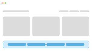
Trust Bar
Reflective
- Shipping, returns and secure payment up front
- Persistent across every page of the store
- Answers the Help & Documentation gap
- Easy to tune out once it becomes chrome

Emotional Product Card
Visceral + behavioural
- Where the first impression is formed
- Hover motion and quick-add give instant feedback
- Repeated across the grid, so small gains add up
- Too much motion slows down scanning

Cart Drawer
Behavioural + reflective
- Review the cart without leaving the page
- Clear totals and edits prevent errors early
- Confirms the choice right after adding
- Covers most of the screen on mobile
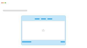
Checkout Trust Layer
Reflective + behavioural
- Reassurance at the moment of highest risk
- Security cues and summary sit next to payment
- Stripe’s payment iframe can’t be restyled
- Too many badges start to feel suspicious
One constraint shaped everything: no libraries beyond the template’s own stack. If emotional design needs extra weight to exist, it’s the first thing to get cut. Every component extends existing shadcn/Radix primitives instead.
- Trust bar: a Server Component. It’s visible on every page and ships zero JavaScript to the browser.
- Product card: split into a server shell and a small client island, so a grid of thirty products ships one copy of the interaction logic, not thirty.
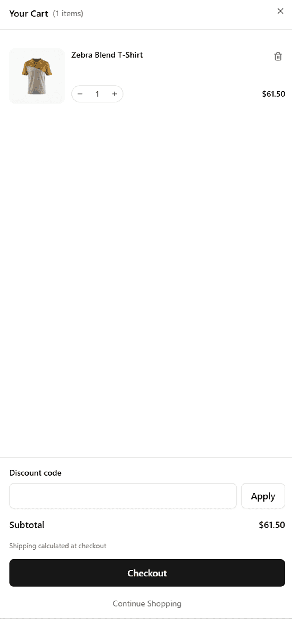
- Cart drawer: built on React 19’s useOptimistic. Quantities update before the network responds and roll back automatically if the request fails. Removing an item, whether by the bin icon or by going below one, always asks first.
Before · YNS template
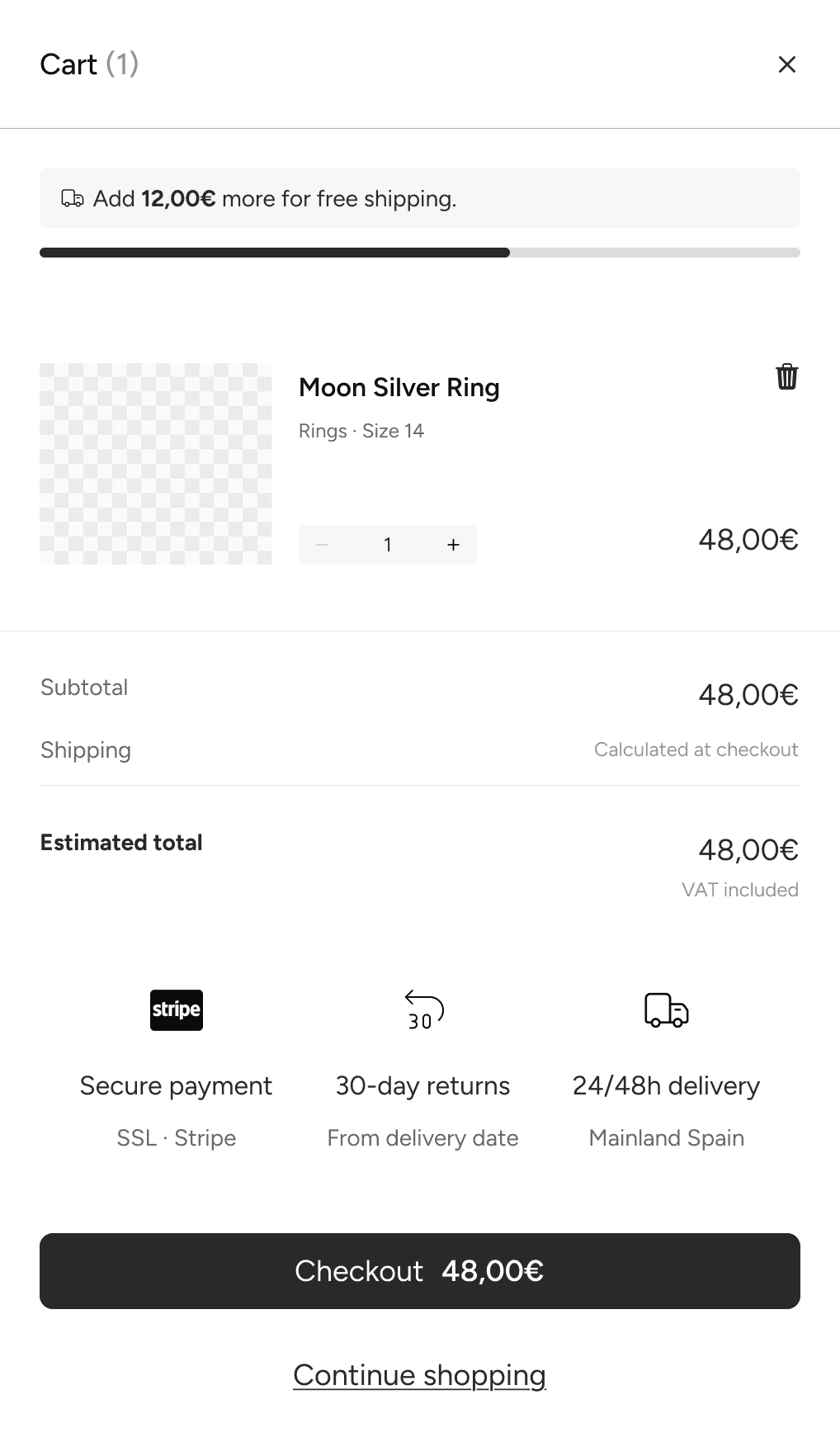
After · prototype component drawer
Trading an inline size picker for a dialog
The prototype showed sizes directly on hover. Once built, it crowded the overlay and fought the link wrapping the card. I replaced it with a dialog that confirms automatically once every option is chosen. It’s one tap for single-attribute products, and it’s properly accessible.

The most anxious moment is the one the store doesn’t own
The fourth component never shipped as designed. Payment is fully delegated to Stripe’s hosted checkout, and the store’s code can’t touch that page.
That turned out to be the most revealing finding of the build. The moment with the most at stake, handing over card details, happens on the one surface the store has given away. I moved the trust signals into the cart footer, the last surface the store controls before the handoff.

Emotional design can walk someone up to the payment step. It can’t go through it. Every delegated surface (payments, auth, embedded widgets) is a place where nobody is designing for trust.
Same template, real competitor, same people
To isolate the system, I compared it against a live jewellery store built on the same template rather than against the bare demo.
- 6 participants, within-subjects, with the order counterbalanced (three saw each store first)
- 4 tasks per store, each targeting one component
- SUS, a hedonic questionnaire (emotional response, perceived trust, purchase intent) and a closing interview
What the metrics saw, and what they missed
- Time to manage the cart
- 72s
 36s
36s - Time to find returns and payment info
- 30s18s
- Perceived trust, on a 7-point scale
- +0.58
- Participants who preferred the redesign
- 6/6
The loudest signal was the order
None of the differences reached statistical significance; with six people, they couldn’t. And one effect dwarfed everything else. Whichever store participants saw second scored about 24 SUS points higher, for all six of them. The difference between versions was under one point.
| Participant | 1st store evaluated | 2nd store evaluated |
|---|---|---|
| P4 · A, saw the live store first | 97.5 | 100 |
| P2 · B, saw the redesign first | 82.5 | 95 |
| P3 · B, saw the redesign first | 70 | 95 |
| P6 · A, saw the live store first | 65 | 90 |
| P1 · B, saw the redesign first | 57.5 | 90 |
| P5 · A, saw the live store first | 55 | 100 |
| Mean | 71.25 | 95 |
Counterbalancing cancels that out in the averages, but it also means the usability comparison says little on its own. What survives is directional and consistent across three independent sources: the trust scores, the unanimous preference and what people remembered.
There’s also one failure worth owning. One participant removed an item from the cart and believed the task was done when it wasn’t. The confirmation dialog still isn’t clear enough.
Measure only efficiency, and you’ll only build efficiency
This study didn’t prove that emotional design sells more. It showed something more uncomfortable: the standard instrument rated both stores as equivalent, and every participant chose the same one.
What made the difference lived on the reflective level. That’s trust, and it’s exactly the dimension a usability score, a performance audit or a component library doesn’t register.
That’s the blind spot. It isn’t that teams don’t care how people feel. It’s that the tools we use to decide whether something is done can’t see it. If nobody measures trust, nobody owns it. And in a store, trust is what stands between a visit and a payment.
What I’d change
- Remove the order effect. Replicate with a larger, pre-registered sample, or switch to a between-subjects design.
- Measure behaviour, not intent. Track completed checkouts instead of self-reported willingness to buy.
- Take the checkout back. Replace the Stripe redirect with embedded Stripe Elements, so the fourth component can finally be built and tested where it belongs.