
Embassaments (Reservoirs)
Catalonia was deep in drought, and I couldn’t get a straight answer. So I built the tool I wished existed — a live, public dashboard tracking every internal-basin reservoir in the territory.
View the live dashboard (opens in a new tab)Checking a reservoir’s water level shouldn’t take four browser tabs
The ACA — Catalonia’s water agency — gives you one number and a shrug. To actually understand what’s happening — how a reservoir compares to last year, whether a storm moved the needle, which basins are quietly running dry — you had to dig through multiple agencies, cross-reference PDFs, and stitch it together yourself.
I’d been doing exactly that, out of my own concern about the drought. At some point I stopped treating it as a research problem and started treating it as a design problem: the data existed and was reliable, it just had no home.
One dashboard, one number to hold onto
I built a live, publicly accessible dashboard covering all nine of Catalonia’s internal-basin reservoirs, refreshed daily from the region’s official open data API — over 20 years of history per site.
Everything anchors to one deliberately simple KPI: percentage of reservoir capacity filled. The audience for this had to be genuinely public — not water engineers, just anyone worried about the drought. That constraint shaped every decision downstream: no jargon, no assumed expertise, one number simple enough to hold in your head while everything else builds around it.
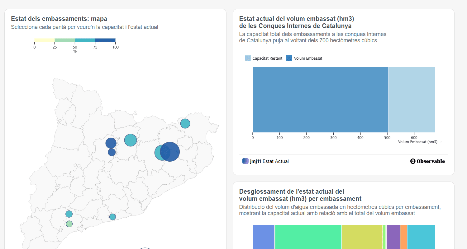
The shipped product is a real, five-section app, not a single infographic: a home that frames the problem in plain language and explains how the water system works, a live current-status view, a historical search tool, a near-real-time monitor, and a seasonal-trends breakdown.
Standing on a few shoulders before drawing a single chart
None of that was obvious at the start. Before drawing anything, I went looking for what already existed — not to copy it, but to understand it and find the actual gap.
- Card, Mackinlay & Shneiderman
- Their multivariate-analysis principle is why the bubble map encodes two variables at once (capacity and % filled) instead of one.
- Edward Tufte
- His principles of comparison and integrated evidence shaped how the dashboard combines text, chart, and data into one readable narrative instead of a chart wall.
- Nathan Yau
- His emphasis on data accessible to non-experts is why the KPI is “percentage filled” in plain language, built for a general audience rather than water engineers.
- Ed Hawkins — Warming Stripes
- Proof a single disciplined visual idea can carry public weight.
- Climática
- Tracked the same reservoirs but reported the numbers without surfacing seasonal patterns or short-term shifts. The gap this project filled: tools that help people understand the situation, not just monitor it.
From sketches to five live visualizations
Sketches in Procreate → wireframes in Figma → build in D3.js, published through Observable Framework.
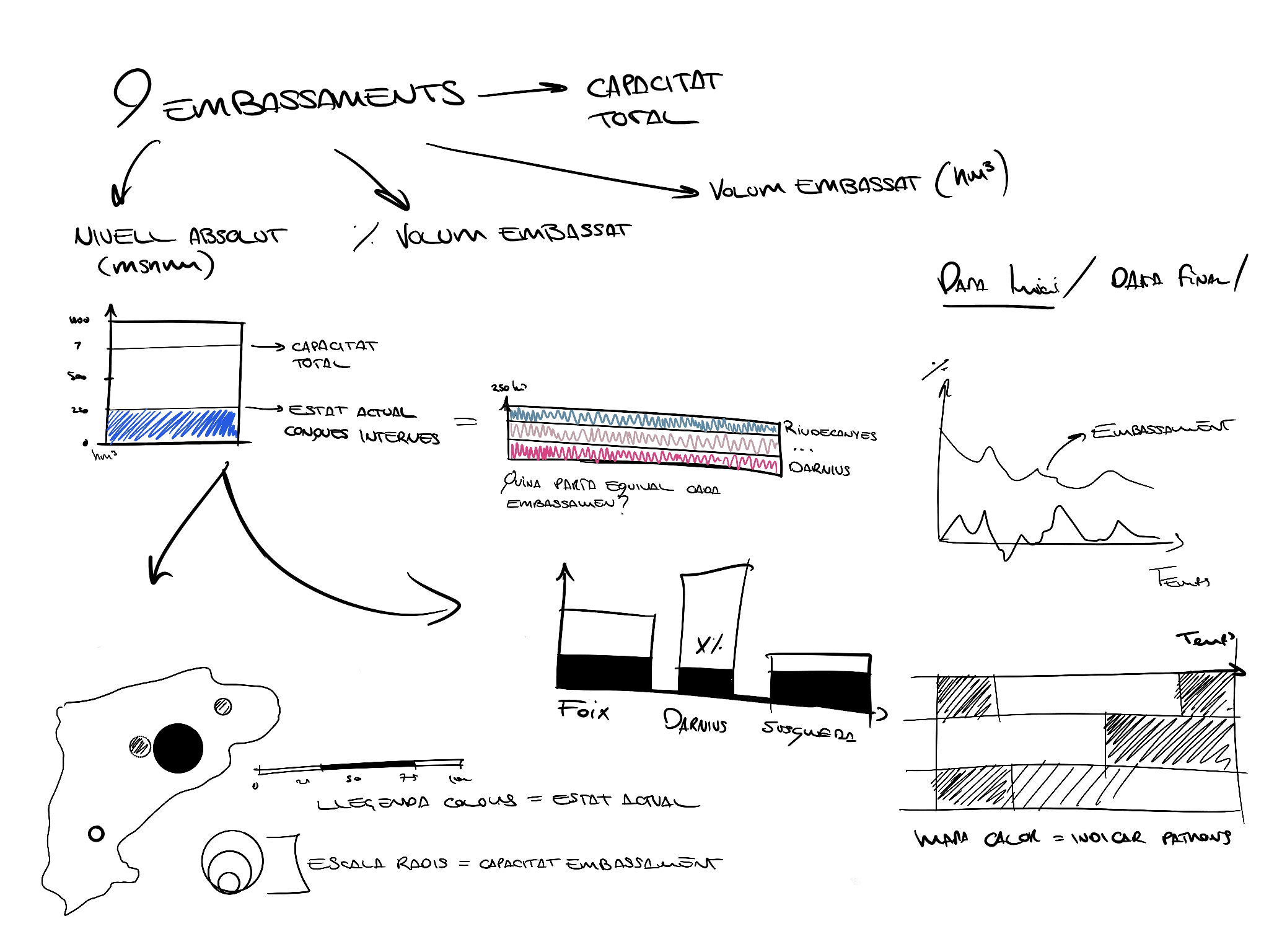
The first instinct was to mirror the ACA tool’s “drop” visual — reservoirs shown as filled circles. It was dropped: human perception of area isn’t linear, so a circle at 25% capacity can visually read as more or less full than it actually is.
A stacked bar chart replaced it — bar length maps directly to value, with no perceptual distortion — and it answers a sharper question: within the current total stored volume, what share does each reservoir hold.
- Bubble map
- Shows geographic spread at a glance; encodes two variables at once
- Stacked bar chart
- Makes part-to-whole obvious; easy to compare totals across basins
- Column chart
- Best for comparing exact magnitudes; familiar, fast to scan
- Line chart
- Shows trend and rate of change clearly; handles 20+ years of history well
- Heatmap
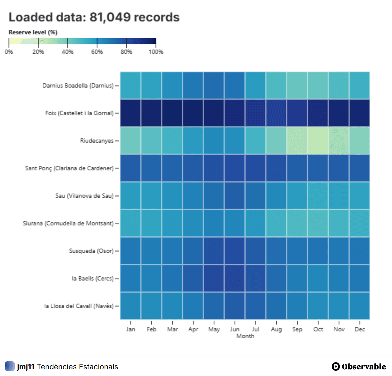
- Reveals seasonal patterns instantly; scales well to many reservoirs at once
Choosing the charts was the easy half. Getting them all onto one page was where the project actually bent.
The iframe trade-off
The “correct” path was rebuilding every chart natively inside Framework’s own structure — reorganizing the data, the code, and the inputs of each visualization from scratch, which demanded time and depth across several languages I didn’t have a strong base in.
Iframes let each notebook export directly instead, at a real cost: proprietary wrapper code with visible watermarks, and every iframe behaving as a closed module — so updating several on the same page means redoing the same work more than once.
What it bought back was time: the dashboard shipped and stayed live instead of stalling mid-migration.
What the data found
In spring 2024, several reservoirs — including Sau, Susqueda and Darnius-Boadella — were running at under 30% of capacity, a clear warning sign at the time. Storage levels consistently peak between April and June each year.
- Reservoirs tracked daily
- 9
- Years of history per site
- 20+
- Spring 2024 — Sau, Susqueda, Darnius-Boadella
- <30%
- Seasonal peak window, every year
- Apr-Jun
A “simple” idea can still demand a real engineering process.
I expected to make some static charts. I ended up owning research, information architecture, visual design, and a full JavaScript/D3.js build — alone — and had to keep re-scoping as the real complexity revealed itself.
Built for the thesis and never promoted beyond it, so there’s no traffic to report. But it’s still live, still refreshing daily, and anyone who wants to check a reservoir today can.
What I carried forward: the decisions that mattered most weren’t design decisions or engineering decisions. They were the places where the two collided — an area-based visual that looked better and read worse, a native rebuild that was correct and would never have shipped. Choosing well there takes both sides of the table, and that’s the work I want more of.